

Custom Printed Corrugated Dispenser Boxes with Logo: Branding Ideas That Attract Buyers
A corrugated dispenser box does more than organize products. When its structure, artwork, logo placement, colors, and printed messaging work together, the packaging becomes a visible branding tool that can attract attention, explain the product, and encourage customers to make a purchase.
This is especially important at checkout counters, retail shelves, café registers, pharmacy displays, salon reception desks, trade-show booths, grocery aisles, and other locations where customers make quick buying decisions.
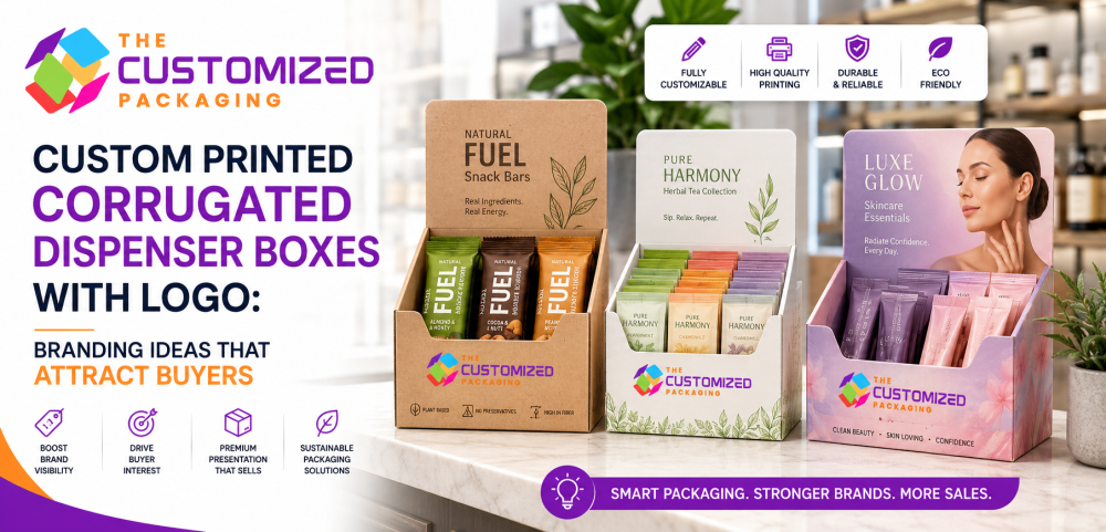
Custom printed corrugated dispenser boxes with logo allow businesses to place snack bars, sachets, cosmetic samples, tea packets, coffee pods, small accessories, healthcare items, stationery, promotional products, and other compact goods inside packaging that continuously promotes the brand.
Instead of displaying products in a plain brown tray or unmarked carton, businesses can use printed dispenser packaging to communicate their logo, product name, colors, benefits, flavor, formula, website, QR code, social-media handle, promotional offer, and purchasing instructions.
Corrugated construction gives the display enough rigidity to remain upright during shipping, stocking, customer access, and repeated handling. The printed panels then transform that structure into a miniature retail advertisement.
The most effective branding does not simply cover every panel with graphics. It creates a clear visual hierarchy. Customers should be able to identify the brand, understand the product, and recognize the main reason to purchase it within a few seconds.
Logo size, artwork placement, background color, typography, product visibility, opening design, header height, printing method, and finishing options all affect how buyers perceive the display.
At The Customized Packaging, we create custom printed corrugated dispenser boxes, branded countertop displays, snack-bar dispensers, sachet display boxes, cosmetic product displays, gravity-feed cartons, shelf-ready packaging, corrugated boxes with logo, custom dividers, printed headers, wholesale dispenser boxes, and bulk retail packaging for businesses throughout the USA.
For broader information about dispenser structures, corrugated flute profiles, kraft and white materials, printing technologies, perforations, inserts, pricing, supplier selection, and wholesale manufacturing, read our main pillar article titled “Custom Corrugated Dispenser Boxes: The Complete Guide to Styles, Materials, Printing, and Wholesale Ordering.”
Why Branding Matters on Corrugated Dispenser Boxes
The Packaging May Remain Visible Longer Than the Product
A corrugated dispenser box may remain on a retail counter or shelf for days or weeks.
Individual products are removed one at a time, but the outer display continues to occupy the same selling space. This means the box can generate repeated brand exposure throughout its useful life.
A plain carton stores products. A custom branded dispenser box helps customers understand who made them, what they offer, and why they should be considered.
The printed carton may be seen by customers who do not purchase immediately. Even when they select another product, consistent logo placement and distinctive colors can improve future recognition.
For new brands, printed dispenser packaging can introduce the company to buyers who have never seen it before.
For established businesses, the display reinforces familiar colors, typography, logos, and product positioning.
The branding should remain visible whether the dispenser is completely full, partially empty, or holding only the final few units.
Printed Dispenser Boxes Create a Miniature Retail Billboard
Small Packaging Can Communicate a Focused Message
Retail displays do not always need to be large to influence customer attention.
A compact dispenser box placed near a register, product sampling area, or category shelf can communicate a focused message at the exact place where a customer is considering a purchase.
A tall header panel can present the logo and product name above the merchandise. The front retaining wall can display the main benefit. Side panels can explain ingredients, directions, flavor options, or online ordering.
This allows the box to function like a small billboard.
The most effective displays avoid excessive messaging. Customers should not need to read several paragraphs before understanding the product.
A simple visual sequence often works best:
The logo establishes the brand.
The product name explains what is being sold.
The primary benefit gives customers a reason to consider it.
The visible products confirm what they will receive.
The call to action encourages the next step.
Place the Logo Where Customers Can See It
Logo Position Should Reflect the Viewing Angle
Logo placement should be planned according to where the dispenser will be used.
A countertop display viewed from the front may place the main logo on the header and front retaining panel.
A shelf-ready dispenser viewed from above may benefit from branding on the upper back panel and side walls.
A dispenser positioned beside a checkout terminal may need branding on both the front and side because customers may approach it from different angles.
The logo should not be printed only on a tear-away shipping panel. Once that section is removed, the brand may disappear from the retail display.
The logo should also remain visible when the dispenser is full. Large products or tall sachets should not cover the main branding.
A secondary logo can appear on the front wall, while the primary logo remains on the raised header.
Best Logo Placement Options
| Logo position | Visibility advantage | Best suited for | Design consideration |
|---|---|---|---|
| Raised header panel | Visible above the products from a distance | Cosmetics, snacks, supplements, samples | Header must remain structurally stable |
| Front retaining wall | Directly faces customers at eye or hand level | Countertop and gravity-feed boxes | Products should not cover the logo |
| Side panels | Supports visibility from multiple approaches | Checkout counters and end-cap displays | Keep important artwork away from folds |
| Top panel | Visible before the carton is opened or from above | Shelf-ready and shipping-to-display cartons | Branding may become less visible after opening |
| Back panel | Provides larger branding and information space | Displays with open fronts | Best for product benefits and brand stories |
| Internal panel | Creates a branded experience as products are removed | Premium cosmetics and subscription products | Interior printing increases cost |
| Removable panel plus permanent panel | Brands both shipping and retail formats | Tear-away dispenser packaging | Main logo must remain after conversion |
| Custom-shaped header | Creates distinctive brand recognition | Promotional and premium retail displays | Complex cutting may increase tooling costs |
The best logo system usually uses one primary placement and one or two supporting placements rather than repeating a large logo on every panel.
Match the Logo Size to the Display
Bigger Branding Is Not Always Better
A logo that is too small may disappear beside colorful product packaging.
A logo that is too large can overwhelm the display and make the packaging appear unbalanced.
The correct size depends on the dispenser dimensions, product count, header height, viewing distance, and surrounding artwork.
A small countertop box may require a simplified logo version with fewer details.
A large shelf-ready display may support the full logo, tagline, and product family name.
Brands should test the artwork at actual size rather than judging only from a zoomed-in screen.
The logo must remain readable after printing on corrugated material, particularly when thin lines, small text, or detailed symbols are involved.
Use Brand Colors to Improve Recognition
Consistent Color Helps Customers Identify Product Families
Color can help customers recognize a brand before they read the logo.
A company that consistently uses purple, orange, green, blue, or another distinctive palette can apply those colors to the dispenser header, front wall, side panels, and product dividers.
Consistent color use can connect several products into one visual family.
A snack brand may use one master color across every dispenser while assigning a different accent color to each flavor.
A cosmetic company may use pastel variations for separate skincare formulas while maintaining the same logo placement and typography.
A tea brand may use green for herbal products, blue for calming blends, and orange for energizing varieties.
The complete display should still look like one brand rather than several unrelated packages.
Choose Colors That Contrast with the Material
Kraft and White Corrugated Surfaces Produce Different Results
Natural kraft corrugated board creates a brown background that can influence printed colors.
Dark purple, black, green, navy, burgundy, red, and orange can create strong contrast on kraft material.
Light pastel colors may appear muted unless a white ink underbase or printed label is used.
White corrugated board provides a brighter foundation for photographs, gradients, pastel colors, and detailed illustrations.
White-top linerboard can provide a cleaner printing surface while maintaining a corrugated structure.
Full-color litho-laminated packaging supports premium graphics and accurate brand-color reproduction.
The same digital artwork may look different on kraft, white-top, coated, and litho-laminated materials. Printed samples are therefore valuable before wholesale manufacturing.
Kraft Branding Ideas for Natural and Artisan Products
Minimal Printing Can Let the Material Support the Message
Kraft corrugated dispenser boxes can create a natural, handmade, industrial, or eco-conscious appearance.
This style works well for artisan snacks, tea sachets, coffee products, organic-style cosmetics, handmade goods, craft supplies, hardware items, and warehouse products.
A one-color logo can create a clean and economical design.
Black ink provides strong readability, while white ink can create a distinctive contrast against brown kraft.
Brands can add simple botanical illustrations, geometric borders, ingredient icons, hand-drawn patterns, or minimal product information.
The natural kraft surface should remain part of the design instead of being completely hidden by excessive ink coverage.
White Corrugated Dispenser Boxes for Clean Branding

Bright Surfaces Support Modern Retail Presentation
White corrugated material creates a clean and professional appearance.
It is frequently used for cosmetics, skincare, healthcare, electronics, pharmacy items, food sachets, supplements, and premium retail goods.
Brand colors can appear brighter and more consistent on a white background.
White packaging also supports detailed product photographs, soft gradients, minimal black typography, and pastel artwork.
Businesses should remember that white surfaces can show scuffs, dust, and handling marks more easily than natural kraft.
The board grade, printing method, coating, storage, and transportation conditions should be considered when maintaining a clean retail appearance.
Full-Color Printed Dispenser Boxes for Maximum Visual Impact
Detailed Artwork Can Help Products Compete for Attention
Retail counters and shelves can contain many competing products.
A full-color printed dispenser box can use photographs, illustrations, patterns, gradients, color blocks, and premium artwork to create stronger differentiation.
Food brands can show ingredients, product textures, flavors, or serving ideas.
Cosmetic brands can use botanical artwork, skincare imagery, soft color transitions, and formula-based graphics.
Technology accessory brands can use bold geometric designs and clear product icons.
Full-color packaging should remain organized. Too many graphics can make the display difficult to understand.
The design should direct attention toward the brand, product, and purchase message rather than treating every panel as a separate advertisement.
Select Typography That Remains Easy to Read
Customers May Only Look at the Display for a Few Seconds
Typography should support quick decision-making.
The product name should be larger than secondary information.
A benefit such as “High Protein,” “Hydrating Formula,” “Organic Herbal Blend,” or “Fast Charging” should remain readable from the customer’s normal viewing distance.
Decorative fonts may be used for selected brand elements, but small instructions and product details should use a clear typeface.
Thin lettering may disappear on textured corrugated surfaces.
Small text can also become difficult to read when printed near folds, cutouts, perforations, or flute impressions.
Businesses should review a full-size printed proof and test readability under realistic retail lighting.
Create a Clear Visual Hierarchy
Every Printed Element Should Have a Defined Role
A successful dispenser box design guides the customer through the information in a logical order.
The main logo establishes the brand.
The product name identifies the item.
The primary benefit provides a reason to purchase.
The flavor, formula, size, or quantity supports product selection.
The call to action encourages engagement.
Secondary details such as ingredients, instructions, contact information, and environmental guidance can appear on the side or back panels.
When every piece of information has the same size and visual importance, the display can feel crowded.
A clear hierarchy makes the packaging easier to understand and more professional.
Branding Ideas by Product Category
| Product category | Effective branding direction | Useful printed elements | Recommended material direction |
|---|---|---|---|
| Protein and snack bars | Bold colors, ingredient imagery, energetic typography | Flavor, protein content, product benefit, logo | Kraft, white-top, or full-color E flute |
| Tea and coffee sachets | Natural colors, botanical illustrations, organized sections | Blend names, brewing guidance, flavor coding | Kraft or white corrugated |
| Cosmetic samples | Pastel palettes, premium gradients, botanical or clinical graphics | Formula, skin benefit, usage, QR code | White E flute or litho-laminated board |
| Healthcare products | Clean layout, clear identification, restrained colors | Size, quantity, instructions, warnings | White corrugated board |
| Electronics accessories | Strong color blocks, technical icons, modern typography | Compatibility, features, barcode, product image | White-top or full-color corrugated |
| Hardware and industrial parts | Simple identification, strong contrast, practical labeling | Part number, quantity, size, reorder code | Kraft B flute or stronger board |
| Promotional samples | Campaign-based artwork and clear call to action | Offer, QR code, social handle, campaign message | Digitally printed E flute |
| Natural skincare | Soft greens, neutrals, ingredient illustrations | Formula, key ingredients, product benefits | Kraft or white corrugated |
| Candy and impulse products | Bright colors, playful patterns, clear flavor cues | Price promotion, flavor, logo, product image | Full-color printed corrugated |
| Office and stationery products | Clean organization and product coding | Item name, quantity, reorder information | Kraft or white corrugated |
The design should match the product category while remaining consistent with the wider brand identity.
Use the Product as Part of the Display Design
Visible Merchandise Can Strengthen the Artwork
The product itself should contribute to the visual presentation.
If snack-bar wrappers use orange, green, and brown, the dispenser can use related brand colors without copying every wrapper detail.
Cosmetic sachets may be organized by shade, formula, or fragrance to create an attractive color arrangement.
Tea packets can be divided into sections that create a natural progression across the display.
The opening should reveal enough of the product for customers to recognize what is being sold.
A dispenser that hides most of the merchandise may require more printed explanation.
A well-designed opening allows the product and printed box to support one another.
Frame the Opening with Branded Graphics
The Cutout Can Become Part of the Artwork
The front opening does not have to look like an empty section cut from the box.
Printed borders, patterns, color blocks, or directional graphics can frame the dispensing area.
A curved opening may be surrounded by a contrasting color.
A gravity-feed slot can include arrows or a visual path that guides customers toward the front product.
A cosmetic display may use a floral or gradient frame around upright sachets.
A snack dispenser may use ingredient illustrations near the opening.
The graphics should not interfere with product access or make the opening difficult to understand.
Design the Header as the Main Sales Message
Vertical Space Can Increase Brand Visibility
A raised header panel allows businesses to communicate more without increasing the counter footprint.
The logo can appear at the top, followed by the product name and a short benefit.
A header may also display a promotional message such as “Try a New Flavor,” “Perfect for Travel,” “Daily Hydration,” or “Available Here.”
The header should not contain excessive small text.
Customers may view it from several feet away, so the most important message should be easy to understand quickly.
Header artwork should coordinate with the front and side panels rather than looking like a separate sign attached to the box.
Add a Short and Specific Call to Action
Clear Direction Can Encourage Buyer Engagement
A call to action tells customers what to do next.
The message should match the product and retail environment.
A snack display might use a short purchase-oriented statement.
A skincare sample box might encourage customers to scan a QR code or try a formula.
A tea display could invite buyers to choose a blend.
An electronics-accessory dispenser may emphasize convenience or immediate availability.
The message should remain brief.
Long promotional sentences are unlikely to be read at a busy checkout counter.
QR Codes Can Extend the Printed Experience
Small Packaging Can Connect Customers to More Information
A dispenser box has limited space, but a QR code can connect customers to a website, product demonstration, ingredient list, ordering page, subscription program, discount offer, loyalty account, review page, or social-media campaign.
The code should appear on a flat panel with sufficient contrast.
It should not cross a fold, perforation, cutout, or heavily textured area.
The surrounding design should leave enough blank space for reliable scanning.
A short message can explain where the QR code leads.
Businesses should test the code using several devices before production and maintain the destination page while the packaging remains in use.
Social-Media Branding on Dispenser Packaging
Retail Displays Can Encourage Customer Sharing
Customers may photograph attractive product displays, especially when the packaging uses strong colors, organized products, and recognizable branding.
The dispenser can include a social-media handle, campaign hashtag, or short invitation to share the product.
The logo should remain visible in customer photographs.
Cosmetics, snacks, beverages, specialty foods, and seasonal products can benefit from packaging designed with social sharing in mind.
However, social information should remain secondary to product identification and purchasing details.
The front panel should not become crowded with usernames, hashtags, and several platform icons.
Use Compartments as a Branding System
Dividers Can Organize Both Products and Visual Information
A divided dispenser can separate flavors, formulas, colors, or product types.
Each compartment can use a small label or color block.
A tea display might divide green, herbal, black, and fruit blends.
A cosmetic dispenser may separate hydrating, brightening, calming, and exfoliating formulas.
A snack display could organize chocolate, fruit, nut, and protein options.
The compartment labels should remain consistent in size, typography, and placement.
The larger box should still communicate one main brand rather than looking like several unrelated displays.
Seasonal Branding Without Replacing the Complete Box
Flexible Printed Components Can Extend Packaging Use
Seasonal promotions can increase product interest, but producing an entirely new corrugated dispenser for every campaign may create unnecessary inventory.
Businesses can use interchangeable printed sleeves, labels, header cards, stickers, or promotional inserts.
A standard branded dispenser can support Christmas, Valentine’s Day, Mother’s Day, back-to-school, summer, holiday, or product-launch artwork.
Digital printing can also support shorter seasonal production runs.
The business should estimate demand carefully to avoid storing outdated promotional packaging.
Product Launch Branding
A Dispenser Can Introduce New Items at the Point of Sale
A custom printed dispenser box can create a dedicated space for a new flavor, formula, product size, or limited edition.
The design can distinguish the launch while remaining connected to the parent brand.
A contrasting accent color may indicate that the product is new.
A short header message can explain the main difference.
QR codes can connect customers to launch videos, product information, or introductory offers.
Short-run digital printing may allow brands to test the campaign before committing to a large wholesale production order.
Branding for Retail Chains and Multiple Locations
Consistency Helps Every Display Represent the Same Brand
Businesses supplying several stores, franchises, salons, cafés, pharmacies, or sales representatives need consistent packaging.
A wholesale printing run helps maintain logo position, colors, dimensions, opening style, and artwork across all locations.
The structural design should also make setup easy for retail employees.
A shelf-ready dispenser can arrive filled and convert into a branded display after the front section is removed.
Simple opening instructions can reduce setup errors.
The visible branding should remain consistent even when different locations arrange the products slightly differently.
Keep Branding Visible as Products Sell
Empty Space Should Not Weaken the Display
The appearance of the dispenser changes as inventory decreases.
When a box is full, products may cover much of the interior.
When only a few units remain, larger sections of the inside walls become visible.
Interior printing, repeating patterns, a branded back panel, or a contrasting insert can help the display continue looking intentional.
The front logo should remain visible at every inventory level.
The final product should not sit too far below the front wall or disappear at the back.
Gravity-feed ramps and raised bases can keep products in a visible selling position.
Flexographic Printing for Branded Wholesale Boxes
Simple Artwork Can Provide Strong Value at Volume
Flexographic printing is commonly used for corrugated packaging.
It is suitable for logos, text, product codes, handling information, and limited-color artwork.
For large wholesale quantities, the printing-plate setup can be distributed across more boxes, helping reduce the unit cost.
One-color and two-color flexographic printing can work especially well on kraft corrugated dispensers.
Businesses using simple branding can create strong results without full photographic artwork.
The number of colors, printing plates, coverage, board surface, and production quantity influence the price.
Digital Printing for Short Runs and Multiple Designs
Brands Can Test Artwork Before Ordering in Bulk
Digital printing can support full-color graphics without conventional printing plates.
It is useful for prototypes, low-minimum orders, regional campaigns, several product variations, seasonal graphics, and new-product testing.
A brand may use one structural design while printing different artwork for separate flavors or formulas.
This allows businesses to evaluate customer response before investing in a larger wholesale order.
The unit price may be higher than flexographic printing for very large quantities, but the lower setup requirement can make digital printing practical for shorter runs.
Litho-Laminated Printing for Premium Retail Branding
High-Resolution Graphics Can Strengthen Shelf Presence
Lithographic printing can produce detailed photographs, gradients, small typography, and accurate brand colors.
The printed sheet is applied to corrugated board, creating a process known as litho lamination.
This method is commonly used for high-visibility retail displays, cosmetics, electronics, specialty foods, healthcare products, and premium promotional packaging.
Litho-laminated dispenser boxes may include smooth surfaces, full-color graphics, and premium finishing.
The process adds production stages and can cost more than direct flexographic printing.
The visual quality should support the value and market position of the product.
Premium Finishes for Corrugated Dispenser Boxes

Selected Details Can Increase Perceived Value
Foil stamping, spot UV, embossing, debossing, matte lamination, gloss lamination, and specialty coatings can be added to selected dispenser designs.
Foil can highlight the logo or product name.
Embossing creates a raised tactile effect, while debossing presses the artwork into the surface.
Spot UV adds gloss to selected design areas.
Premium finishing can work well for cosmetic displays, luxury foods, gift products, and limited-edition campaigns.
Finishes should be used selectively.
Too many effects can make the box look complicated and may affect cost, folding, recyclability, and production time.
Printing Method and Branding Comparison
| Printing method | Best branding use | Typical order suitability | Main consideration |
|---|---|---|---|
| One-color flexographic printing | Simple logos and product identification | Medium and large wholesale runs | Limited photographic detail |
| Multi-color flexographic printing | Bold branding and repeating patterns | Larger production quantities | Additional plates increase setup cost |
| Digital printing | Short runs, variations, seasonal campaigns | Low to medium quantities | Unit cost may rise at large volume |
| Litho lamination | Premium graphics, photographs, gradients | Medium and large retail programs | More production stages |
| White ink on kraft | Minimalist premium contrast | Selected short or wholesale runs | Opacity should be tested |
| Interior printing | Branded experience after products are removed | Premium retail displays | Adds coverage and cost |
| Foil stamping | Logo highlights and luxury accents | Premium and promotional packaging | Requires specialized tooling |
| Spot UV | Gloss contrast on selected artwork | High-end full-color displays | May affect material separation |
| Printed labels | Variable product information | Low-volume or multi-product use | Label adhesion must be tested |
The printing method should match the artwork, material, order quantity, retail environment, and available budget.
Barcode and Product Information Placement
Operational Details Should Support the Design
Retail packaging may require barcodes, SKUs, lot codes, quantity information, ingredients, warnings, or usage instructions.
These elements should be integrated into the design rather than added without planning.
Barcodes need adequate contrast and blank space.
They should appear on a flat panel away from folds, flute impressions, cutouts, and perforations.
Product information can appear on the side or back panels, leaving the front area available for branding and purchase messages.
A printed sample should be tested using the scanners expected in the retail environment.
Avoid Common Branding Mistakes
Attractive Artwork Must Still Support Packaging Function
One common mistake is placing the main logo on the removable shipping panel.
Another is allowing products to cover the branding when the dispenser is full.
Some designs include too much text, making the display difficult to understand.
Low-contrast colors can reduce readability on kraft material.
Small typography may disappear on the corrugated surface.
Artwork placed too close to cut lines or folds may become distorted.
A header that is visually impressive but structurally oversized can make the display unstable.
The design should be reviewed as a physical package rather than only as flat artwork.
Request a Dieline Before Designing the Artwork
Branding Should Follow the Actual Box Structure
A dieline shows the cuts, folds, perforations, glue areas, openings, tabs, and panels of the box.
Designers use this template to place artwork correctly.
The business should confirm which panels remain visible after assembly and after any tear-away section is removed.
Logos, barcodes, text, and QR codes should remain inside safe zones.
The dieline should not be resized without approval from the structural packaging manufacturer.
Artwork developed before the structure is finalized may require significant revision.
Digital Proofs and Physical Printed Samples
Both Stages Help Prevent Costly Errors
A digital proof confirms the artwork, panel placement, spelling, colors, and general layout.
It cannot fully show how ink will appear on the selected corrugated material.
A physical sample allows the business to evaluate logo readability, material color, print contrast, product fit, opening performance, header stability, and retail presentation.
Printed samples are especially useful for kraft material, white ink, fine typography, QR codes, barcodes, gradients, and premium finishes.
Businesses should also test the box under realistic lighting because retail environments may affect color appearance.
Wholesale Custom Printed Corrugated Dispenser Boxes
Bulk Production Can Improve Branding Consistency
Businesses supplying multiple retail locations may benefit from wholesale custom printed corrugated dispenser boxes.
A larger production run can help maintain consistent logo placement, colors, material, dimensions, openings, perforations, and inserts.
The cost of cutting dies, printing plates, structural development, color setup, and machine preparation can be spread across more units.
Before ordering in bulk, businesses should approve the physical structure and printed sample.
They should also estimate realistic packaging usage and storage capacity.
A lower unit price may not provide value when a business orders more boxes than it can use before the artwork or product changes.
What Influences the Cost of Branded Dispenser Boxes?
Artwork Complexity Is Only One Pricing Factor
The price of custom printed corrugated dispenser boxes with logo depends on the box dimensions, board grade, flute profile, printing method, number of colors, print coverage, opening design, header, inserts, finishing, quantity, tooling, and freight.
A one-color kraft dispenser usually costs less than a full-color litho-laminated cosmetic display.
Interior printing adds another production surface.
Foil, spot UV, embossing, lamination, and coatings add processing stages.
Several flavor versions may require separate printing setup or digital files.
Wholesale quantities may reduce the unit price, but businesses should compare the complete delivered cost.
How to Choose a Custom Printed Dispenser Box Supplier
Structural and Printing Expertise Should Work Together
A professional supplier should understand both corrugated engineering and branded retail presentation.
The manufacturer should ask about the product dimensions, packed weight, quantity, orientation, dispensing method, retail location, artwork, colors, order volume, and delivery destination.
Businesses should request a dieline, material specification, digital proof, physical sample, printing details, minimum order quantity, tooling costs, production time, and freight information.
The supplier should explain how the logo and product information will remain visible after opening.
Businesses comparing the best custom printed dispenser box manufacturers should review the complete specification rather than selecting only according to the lowest advertised price.
Buy Custom Printed Corrugated Dispenser Boxes Online
Complete Specifications Support Accurate Quotations
Businesses ready to buy custom printed corrugated dispenser boxes online should provide their product dimensions, weight, quantity per box, dispensing direction, retail location, material preference, logo files, artwork requirements, printing colors, finishes, order quantity, and delivery ZIP code.
Vector logo files usually provide better print quality than low-resolution images.
The supplier should prepare a structural dieline before final artwork approval.
A physical prototype should be tested with the actual products.
The final quotation should identify the corrugated material, flute, printing method, colors, coverage, tooling, inserts, finishing, quantity, production time, and freight.
Businesses searching to order custom dispenser boxes with logo should compare identical specifications across suppliers.
Custom Printed Corrugated Dispenser Boxes Across the USA
Branded Retail Packaging for Businesses Nationwide
At The Customized Packaging, we provide custom printed corrugated dispenser boxes with logo for snack brands, cosmetic companies, tea and coffee businesses, pharmacies, retailers, cafés, salons, healthcare suppliers, electronics companies, offices, trade-show exhibitors, and ecommerce businesses throughout the USA.
We create kraft dispenser boxes, white corrugated displays, white-top packaging, full-color countertop displays, gravity-feed cartons, divided sachet boxes, cosmetic displays, tear-away shelf-ready packaging, custom headers, internal ramps, partitions, and wholesale printed packaging.
Businesses searching for custom printed dispenser boxes near me, corrugated display box manufacturer USA, branded countertop displays, wholesale dispenser boxes with logo, custom retail packaging supplier, or order printed corrugated boxes online can request packaging developed around their products and branding.
We support businesses throughout New York, New Jersey, California, Texas, Florida, Illinois, Pennsylvania, Ohio, Georgia, North Carolina, Washington, Massachusetts, Virginia, Michigan, Arizona, Tennessee, Indiana, Missouri, Maryland, Wisconsin, Colorado, Minnesota, Nevada, Oregon, Kentucky, Utah, and other locations across the United States.
Want to Estimate Your Printed Dispenser Box Cost?
Try the Custom Box Packaging Cost Calculator
Businesses planning branded packaging can use the Custom Box Packaging Cost Calculator to develop an initial estimate based on dimensions, box style, material, printing, finishing, inserts, and quantity.
The calculator can help plan custom printed dispenser boxes, countertop displays, snack dispensers, sachet organizers, cosmetic displays, gravity-feed boxes, shelf-ready cartons, kraft packaging, white corrugated displays, and full-color retail packaging.
The final price may change according to the flute profile, board grade, logo colors, printing coverage, header, opening, inserts, premium finishing, tooling, wholesale quantity, freight, and delivery destination.
After reviewing the estimate, businesses can request a detailed custom printed corrugated dispenser box quote based on the complete packaging and branding specification.
Why Choose The Customized Packaging?
Branding Developed Around the Structure and Product
At The Customized Packaging, we help businesses create custom printed corrugated dispenser boxes with logo that combine reliable dispensing, product organization, retail visibility, and consistent branding.
We provide kraft corrugated board, white material, white-top liners, E flute, B flute, digital printing, flexographic printing, litho-laminated graphics, white ink, full-color artwork, custom headers, front openings, gravity-feed ramps, dividers, perforated panels, digital proofs, physical samples, and wholesale pricing.
Our packaging supports snacks, sachets, cosmetics, healthcare products, electronics accessories, office products, promotional items, and other compact retail goods.
As a professional custom box manufacturer and retail packaging supplier, we develop each box around the product dimensions, weight, access requirements, display location, brand identity, order quantity, and shipping destination.
Businesses remain responsible for confirming that selected materials, inks, coatings, adhesives, finishes, inserts, labeling, environmental claims, and product-contact components meet the requirements applicable to their products and markets.
Final Thoughts
Strong Branding Makes the Dispenser Part of the Buying Experience
Custom printed corrugated dispenser boxes with logo can transform an ordinary product holder into a recognizable retail display and ongoing advertising tool.
Strategic logo placement helps customers identify the brand. Consistent colors connect several products into one family. Clear typography explains the product quickly. Header panels increase visibility, while printed front and side panels communicate benefits, flavors, formulas, QR codes, and purchasing information.
Kraft packaging can support natural and minimalist branding. White corrugated board creates a clean presentation. Full-color litho-laminated displays provide detailed and premium graphics.
Flexographic printing can offer strong value for larger wholesale orders, while digital printing supports low-minimum quantities and product variations.
The best design balances visual impact with practical product access. Branding should not interfere with openings, perforations, gravity-feed systems, product visibility, or structural stability.
Physical samples should be tested before wholesale manufacturing to confirm print quality, logo readability, product fit, display performance, and customer access.
Whether you need branded snack dispensers, printed sachet displays, cosmetic countertop boxes, gravity-feed cartons, shelf-ready packaging, wholesale corrugated dispenser boxes with logo, or full-color retail displays, the right branding can attract attention, strengthen recognition, and encourage buyers to engage with the product.
For complete guidance about dispenser styles, materials, flute profiles, printing, inserts, pricing, and wholesale production, read our main pillar article titled “Custom Corrugated Dispenser Boxes: The Complete Guide to Styles, Materials, Printing, and Wholesale Ordering.”
At The Customized Packaging, we create printed dispenser packaging that is built to protect, structured to dispense, and designed to make brands easier to notice, remember, and buy throughout the USA.
